In addition to the aggregate reporting on the HealthAdvisor Dashboard, you can drilldown into the performance of each assessment.
Access a report
From the Dashboard, there are multiple ways to access an individual report:
-
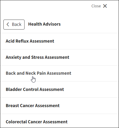
In the main navigation, select HealthAdvisors then click an assessment.
-
In the Manage Assessments table:
Find the assessment in the far right column, click the Manage dropdown arrow, then View Reporting.
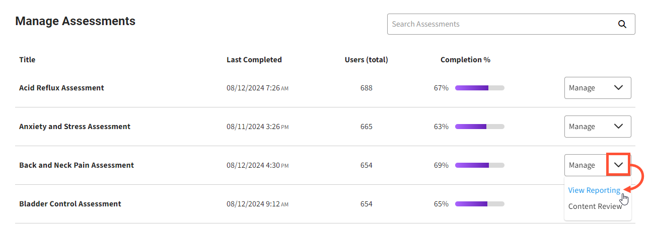
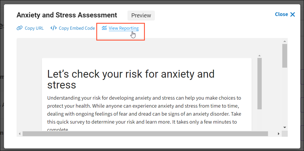
-OR- click an assessment name to open the preview pane, then click View Reporting.
Overview
The charts offer a quick look at key performance metrics for the assessment.
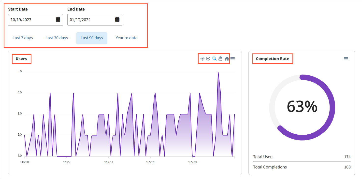
You can view performance for a specific timeframe by:
- selecting a Start Date and End Date, or
- clicking one of the presets:
- Last 7 days
- Last 30 days
- Last 90 days
- Year to date.
The charts then update instantly.
Users
Line graph showing the total number of assessment users in the selected timeframe. This includes those who started the assessment but did not complete it.
Hover over the chart to see user counts for a specific date. Use the chart controls to:
- Zoom in on the overall graph.
- Zoom out on the overall graph.
- Select a specific area to zoom into.
- Pan back and forth on a zoomed-in area.
- Return to the default graph view.
Completion rate
Circle graph showing the total percentage of users who’ve completed the assessments (and conversely, the percent who abandoned). Below the chart, you’ll see the actual counts of total users and completions.
Results
Bar graph showing the distribution of risk scores for all users who completed the assessment.

Hover over the bars to see the total count for each risk score. The table to the right also shows the counts for each risk score and their percentage of the whole.
Demographics
The charts provide a demographic breakdown of all users who completed the assessment.
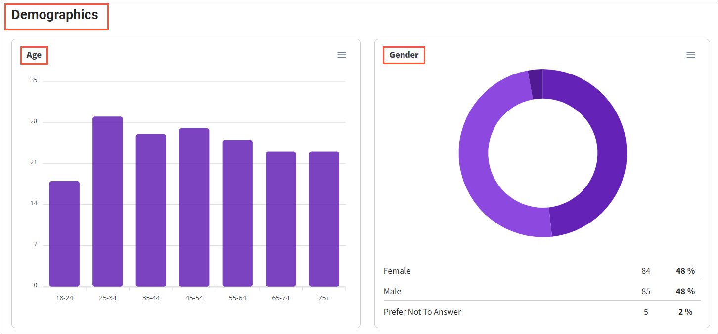
Age
Bar graph showing the age distribution. Hover over the bars to see the total count for each age group.
Gender
Pie chart showing the male/female gender split, as well as those who chose not to specify.
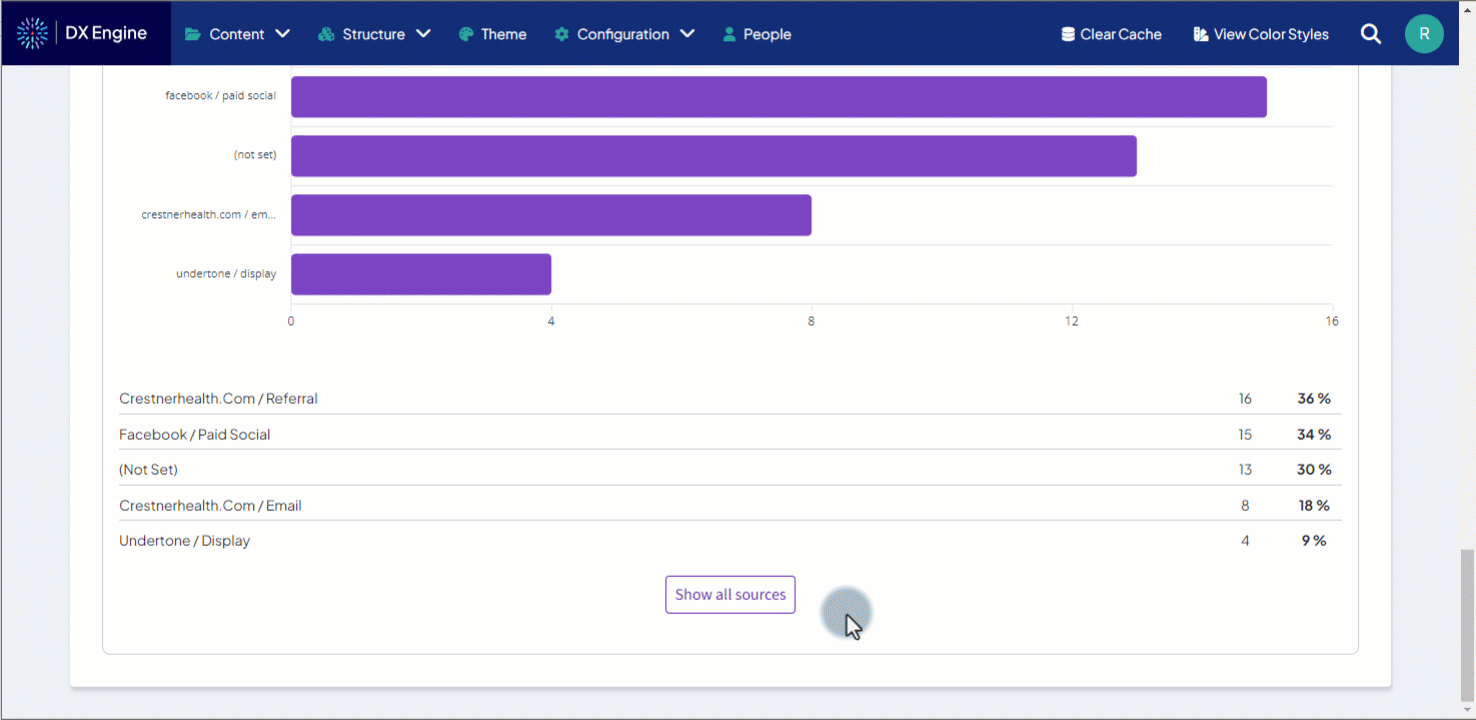
Acquisition
These charts display the number of submitted risk assessments that are associated with Ignite Growth Platform tracking parameters (or UTM parameters, if also used).
Ignite Growth Platform can only capture/display metrics for the following standard UTM parameters:
- utm_medium
- utm_source
- utm_content
- utm_term
- utm_campaign
Select to display either Ignite Growth Platform (IGP) or UTM parameters using the dropdown above the chart itself.
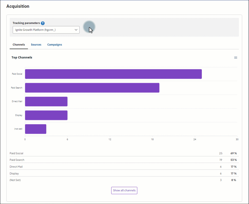
Choose which level of data to display in the charts by selecting one of the three tabs below the Tracking parameters dropdown:
- Channels - displays the number of tracked risk assessments per tactic (e.g. Paid Social, Email, Paid Search, etc.)
- Source - displays the number of tracked risk assessments per traffic source (e.g. referral, Facebook ad, campaign email, etc.)
- Campaigns - displays the number of tracked risk assessments per Ignite Growth Platform campaign
- The bar graph labels that display in this tab are the URL tracking parameters associated with each campaign.
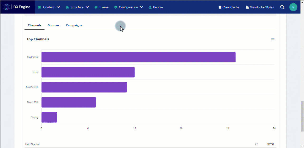
Below the bar chart is a plain numerical table displaying the total number and percentage of the top 5 types of associated risk assessment. Click the Show all … button at the bottom to display any additional values that were recorded.